UX Case Study
Hackathon project
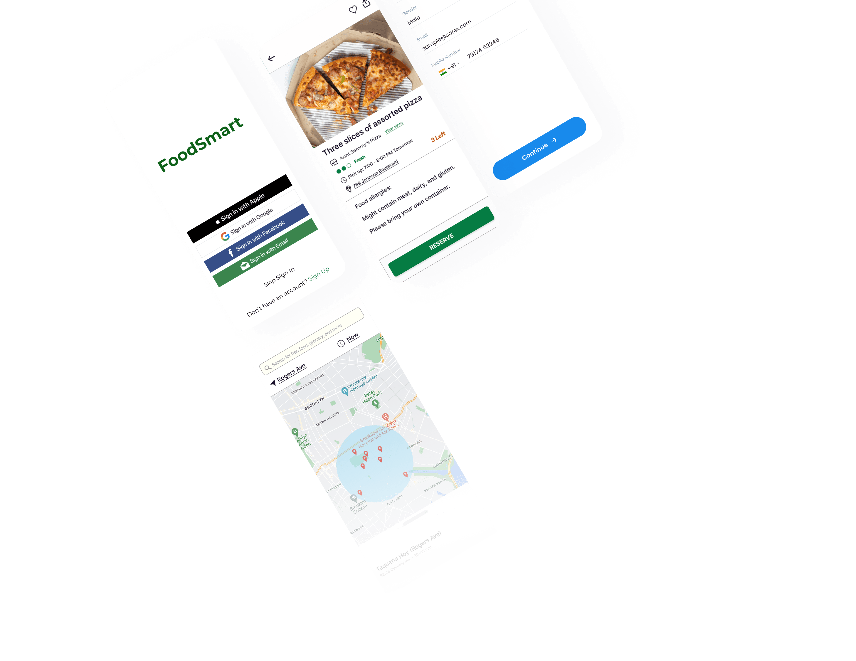
FoodSmart Hackathon Challenge
The "Design for Crisis" Challenge
The challenge was to design for crisis, and we were free to tackle any global crisis that we find relevant to our world today.
Team member
4 designers
Timeline
Summer 2022 (3 weeks)
My role
UI design
Research
Overview
We created an app called FoodSmart, aiming to reduce the global crisis of food wastage and hunger.
Our Process
Discover

Research

Ideate

Design

Process
Brainstorm
To figure out our design challenge, our team ran a brainstorm session to narrow down our topic for the hackathon project.
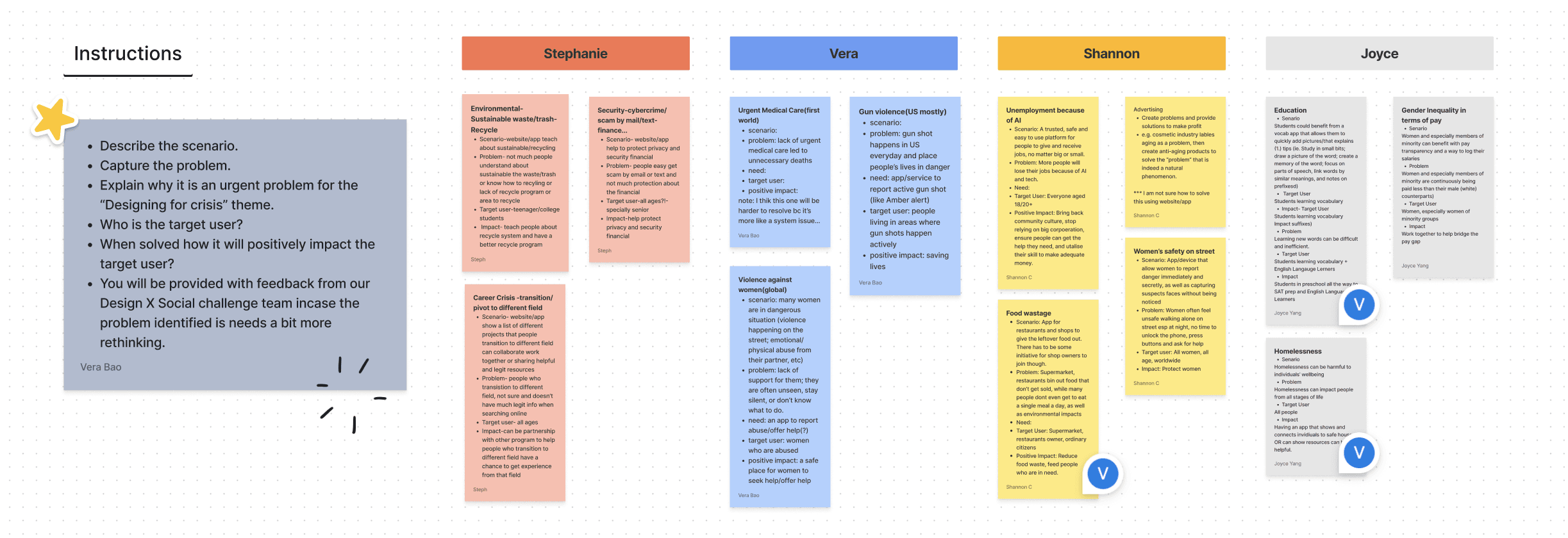
💡 After initial brainstorming, we decided to zoom into the food wastage issue around the globe.


Research
Primary and Secondary Research
To figure out our design challenge, our team ran a brainstorm session to narrow down our topic for the hackathon project.
Research Notes
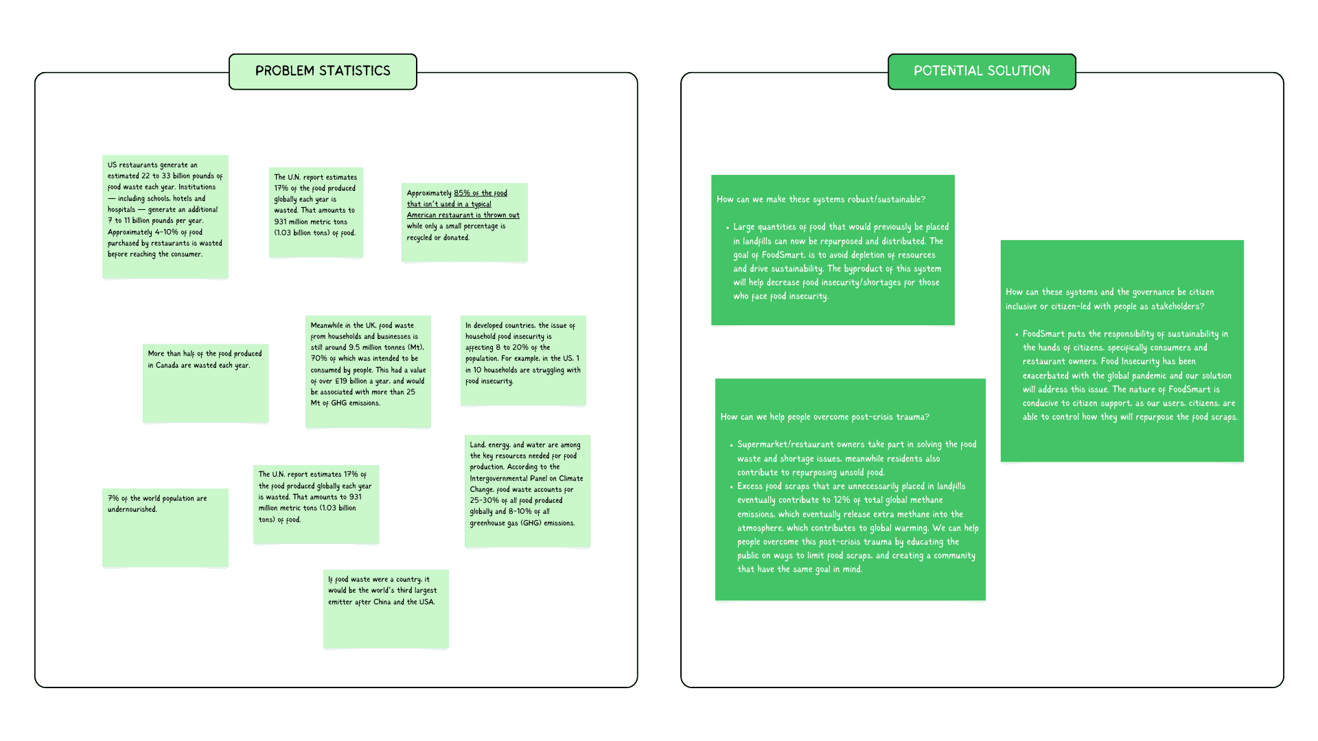
85%
Food that isn’t used in a typical American restaurant is thrown out
1 in 10
US households are struggling with food insecurity
8-20%
Population in rich countries are affected by food insecurity
70%
Food wasted in UK was intended to be consumed by people
Summary
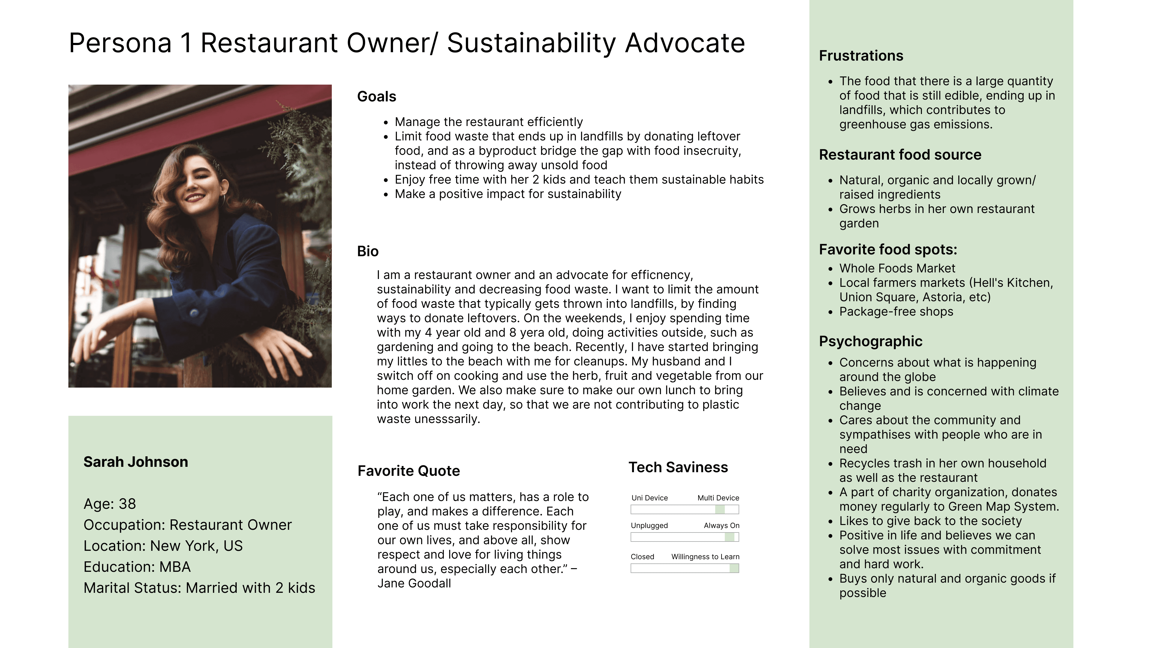
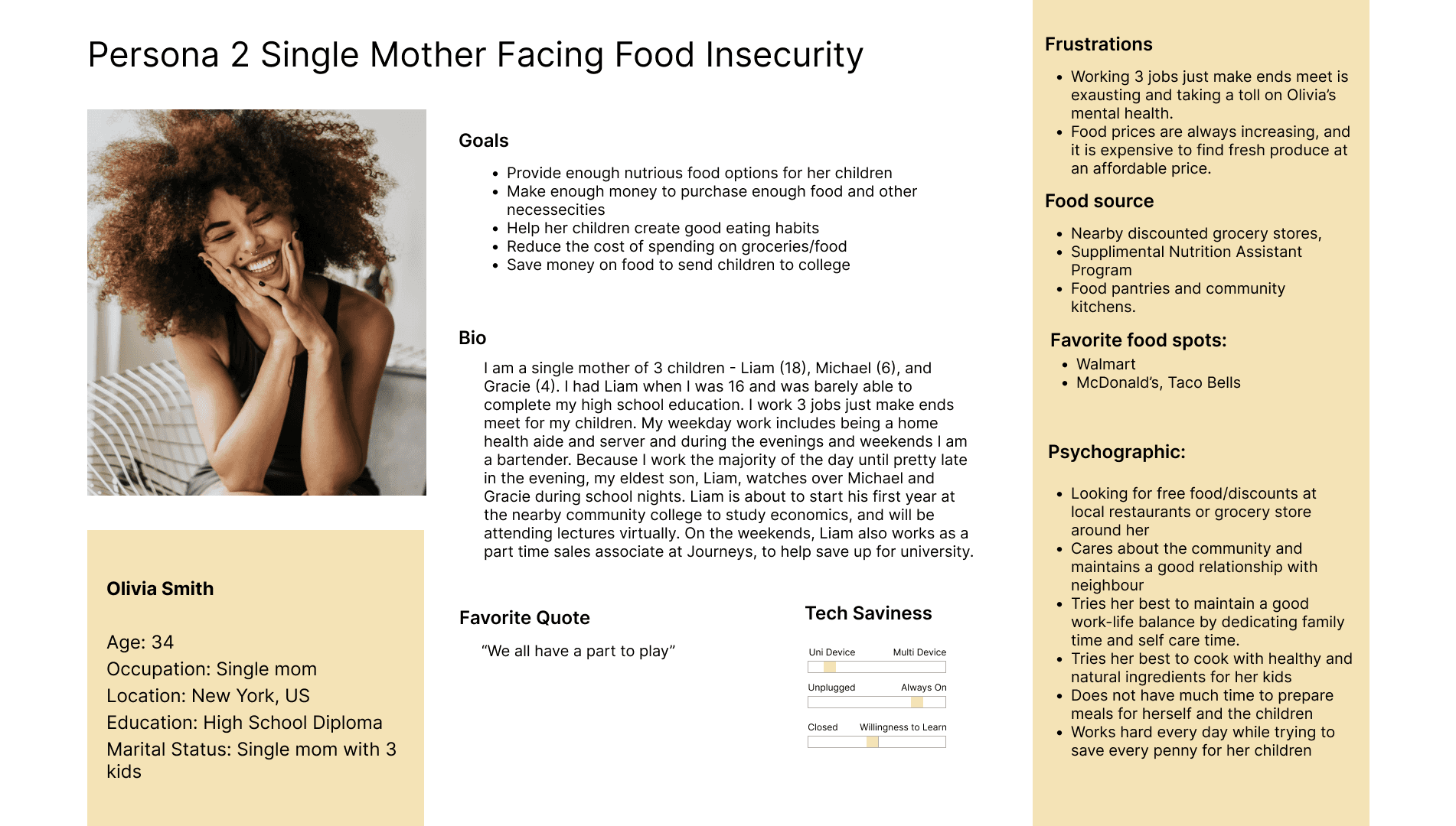
Based on our research, we divided our users into 2 groups:
Food business owners
Hungry citizens
User Persona
UX Audit
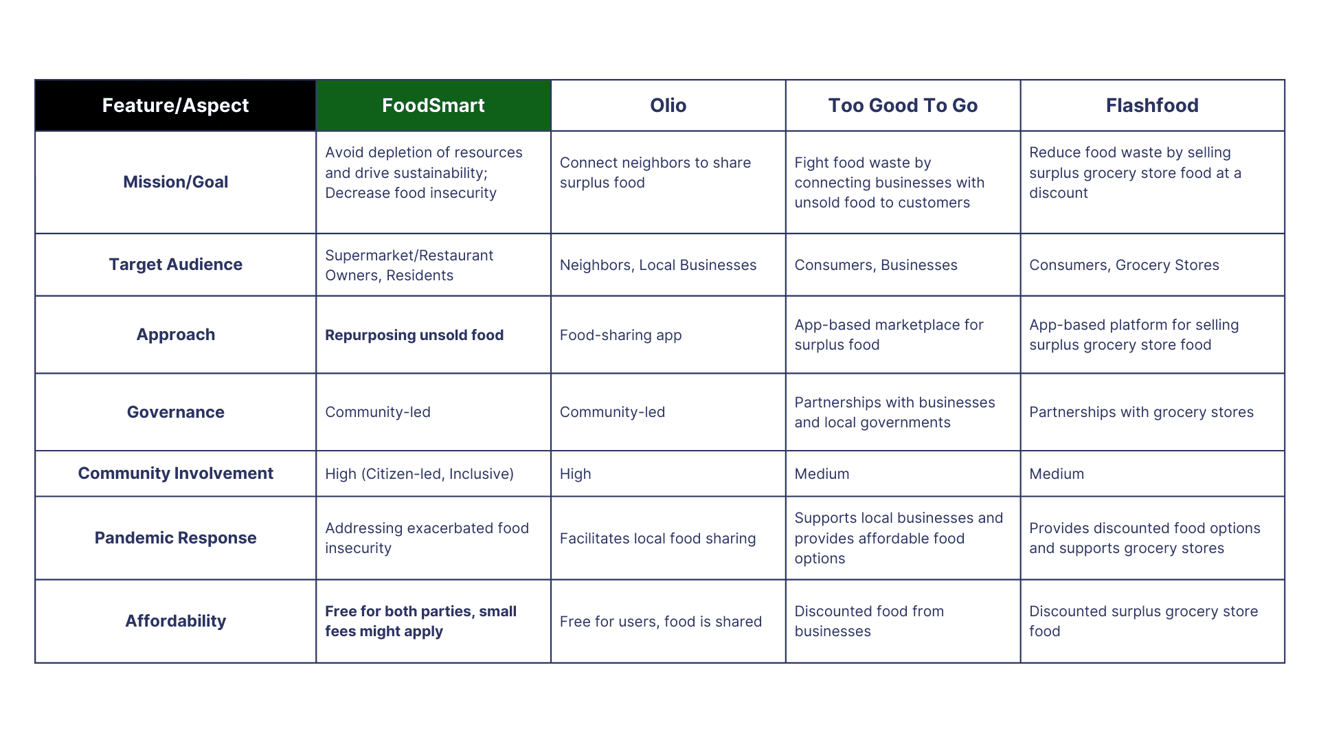
We also ran competitive analysis with 3 similar apps, and narrow down our unique feature:
Free for both parties
Re-purposing unsold food
Restaurants/Stores
Unsold Food
Community
Solution
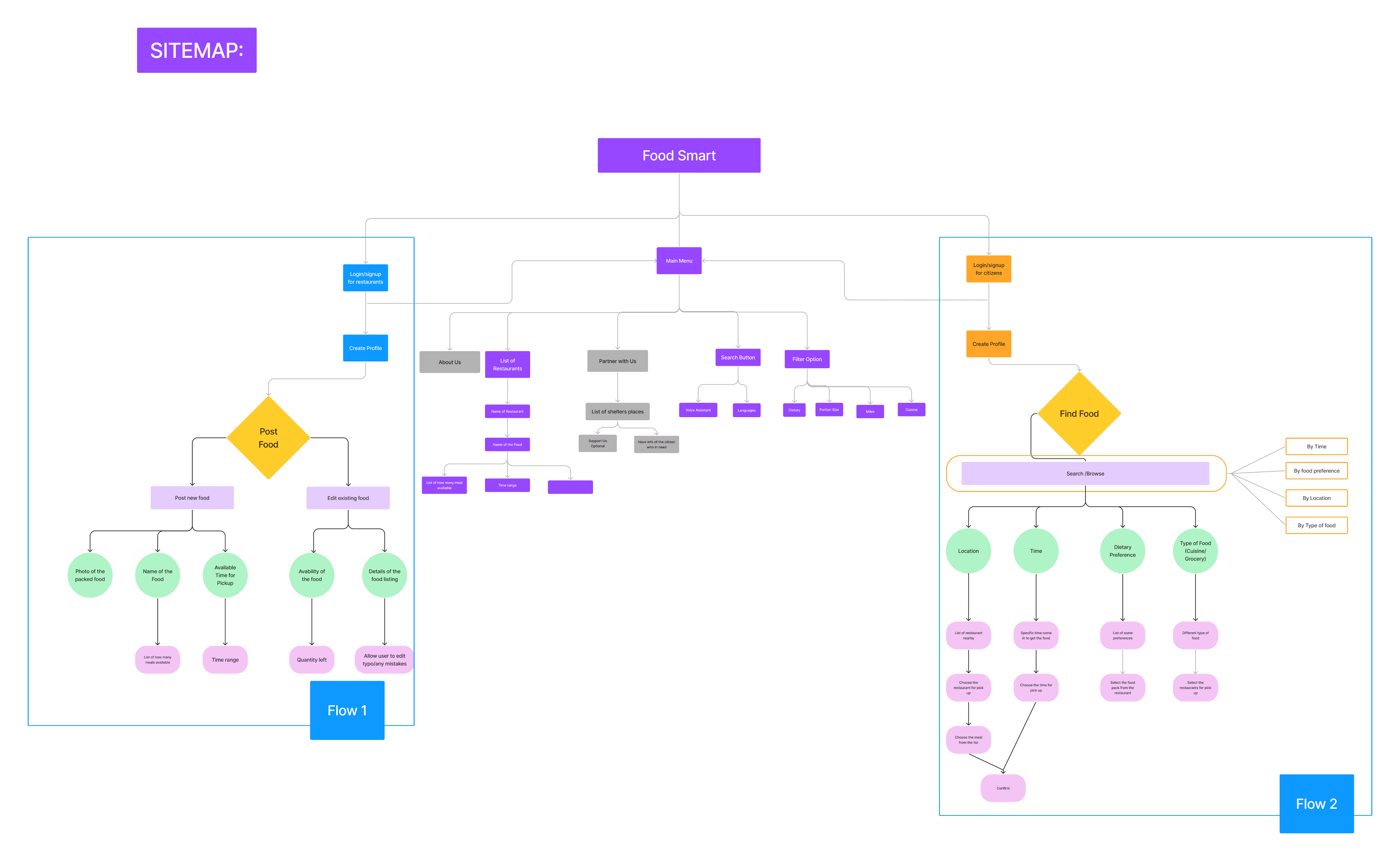
Ideate
Primary and Secondary Research
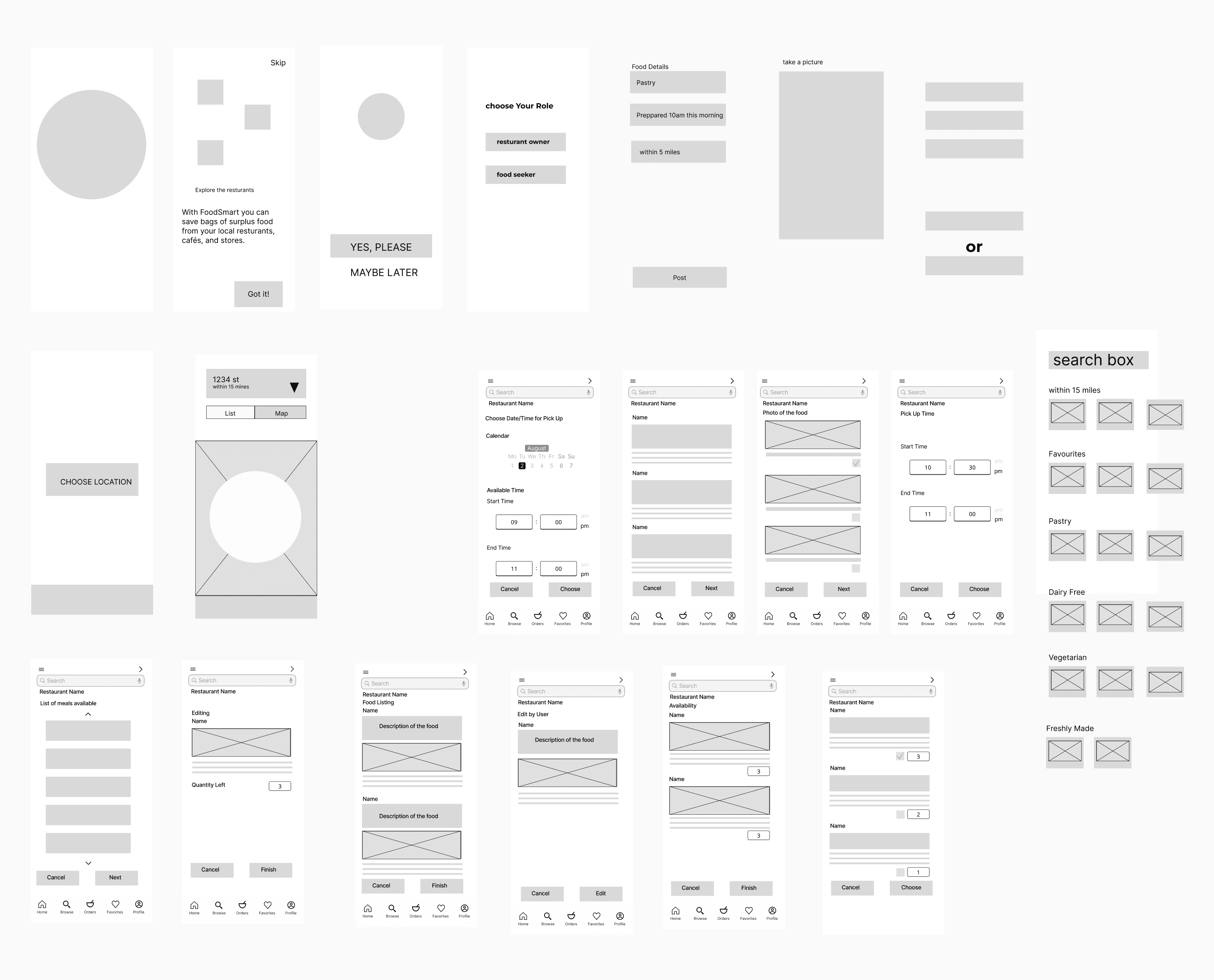
Design
Design system
Item
#FFFFF5
White
#FFFFFF
Background
Text-inactive
#160C28
Text-active
#160C28
Text
Error
#EB5757
Warning
#E2B93B
Success
#27AE60
Info
#C84218
State
Primary
/
#057C43
Brand
Title
Name
50 px
Font size
61 px
Line Height
Subtitle
14 px
21 px
A
a
Heading
Google Fonts
Montserrat
A
a
Body
Caption
Description
Main Item
Name
12 px
18 px
24 px
32 px
Font size
15 px
22 px
36 px
22 px
Line Height
Page Title
Google Fonts
Inter
Menu icons
icons
Icon sets
3. Full size
24 px
2. Save area
2 px
1. Live area
20 px
3
2
1
Rules
Iconography

Frame:
Mobile 390
Number of columns:
6
Margin width:
16 px
Gutter width:
8 px
Grid options
MOBILE
Grid Systems

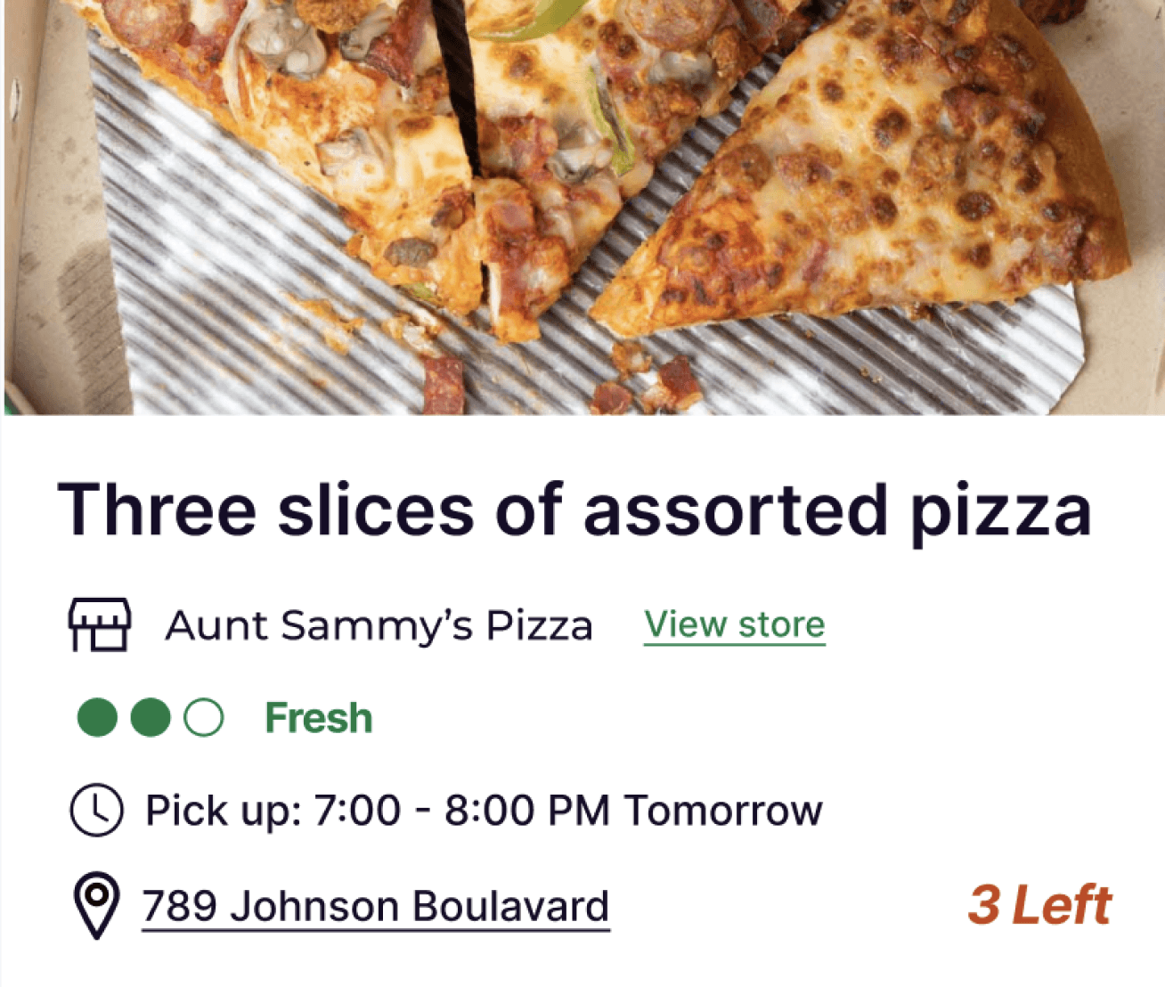


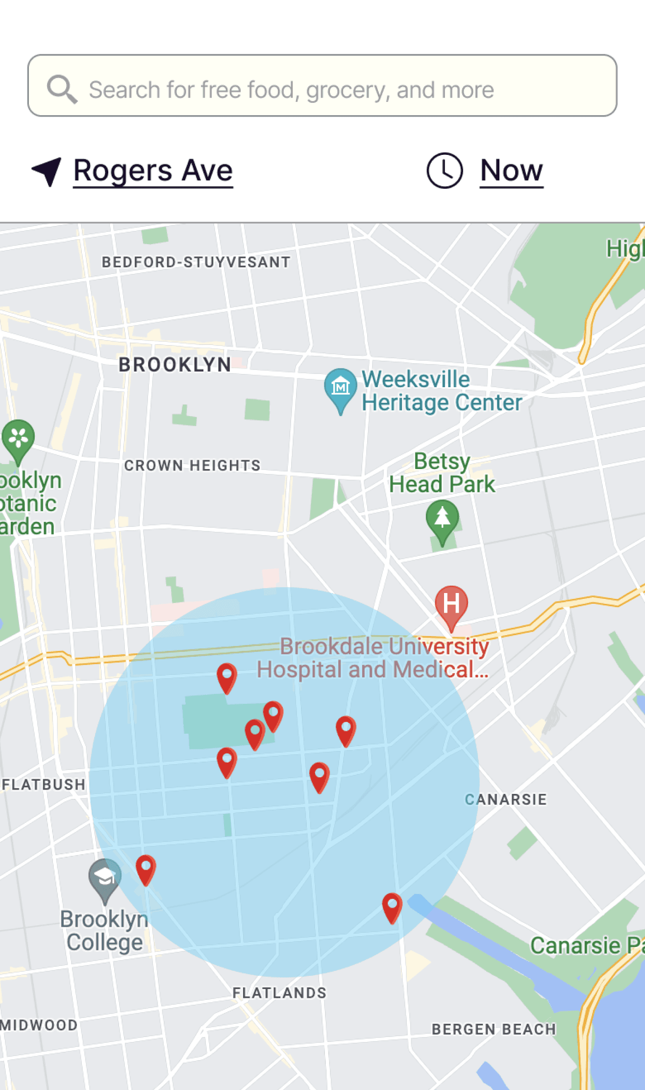
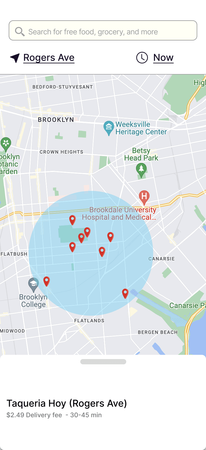
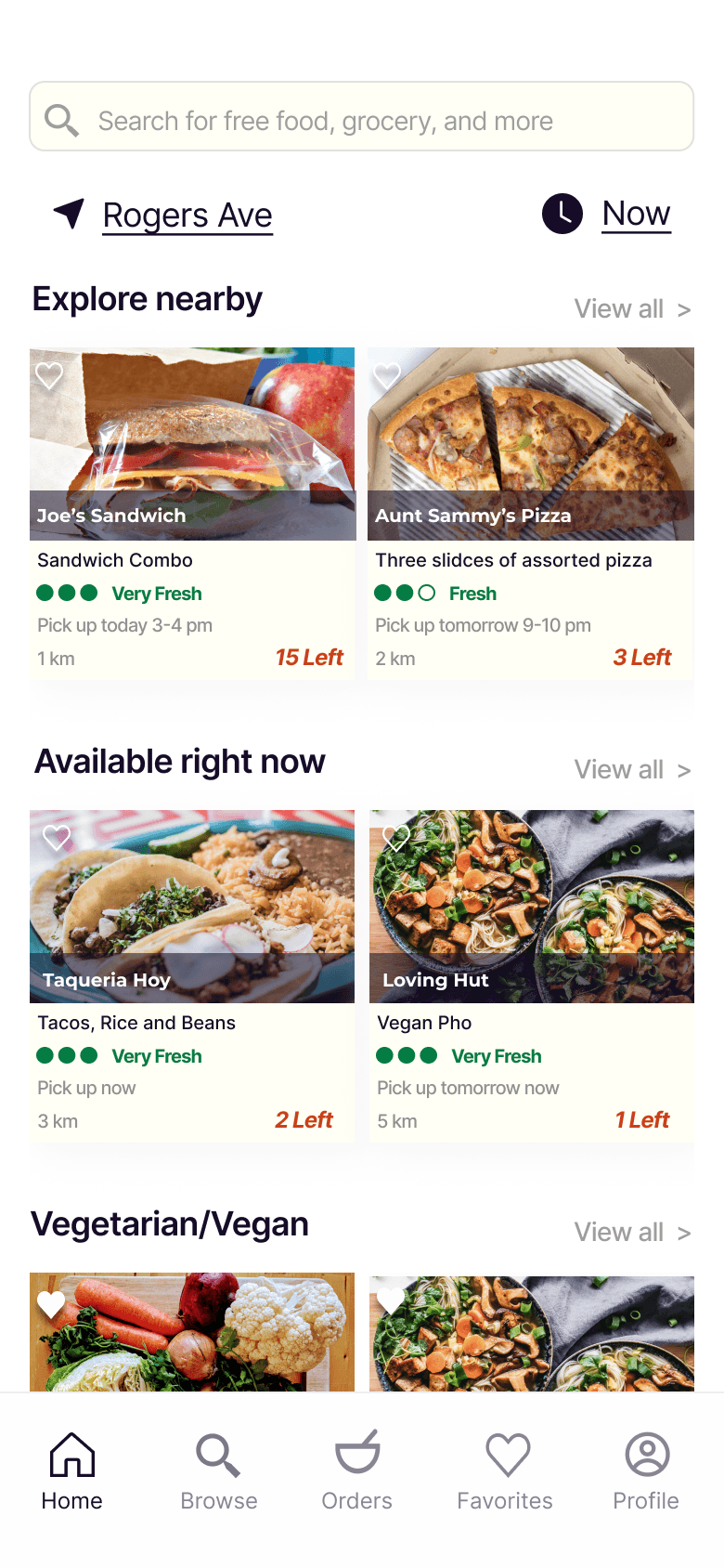
Show all available food options in the desired radius
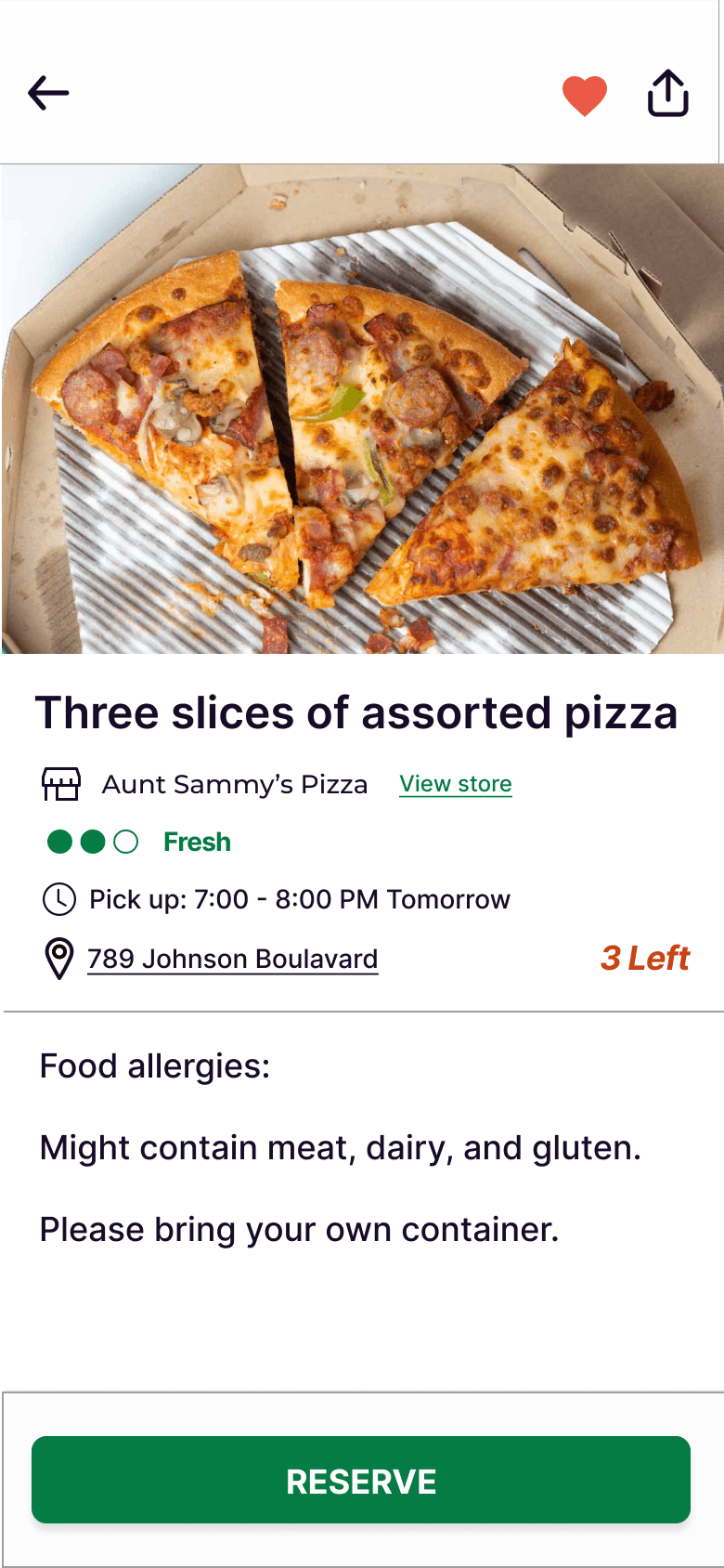
Show the freshness and the quantity of the selected food
Select location and pick up time

Adding the container option to reduce plastic wastes
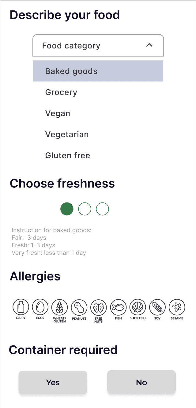
Select potential allergies
Drag to select the freshness
Drop-down to select food category
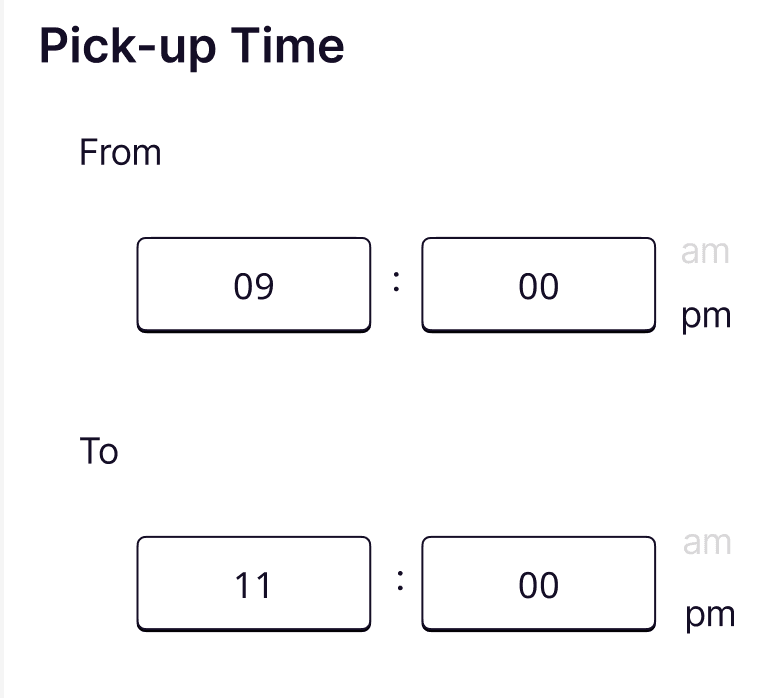
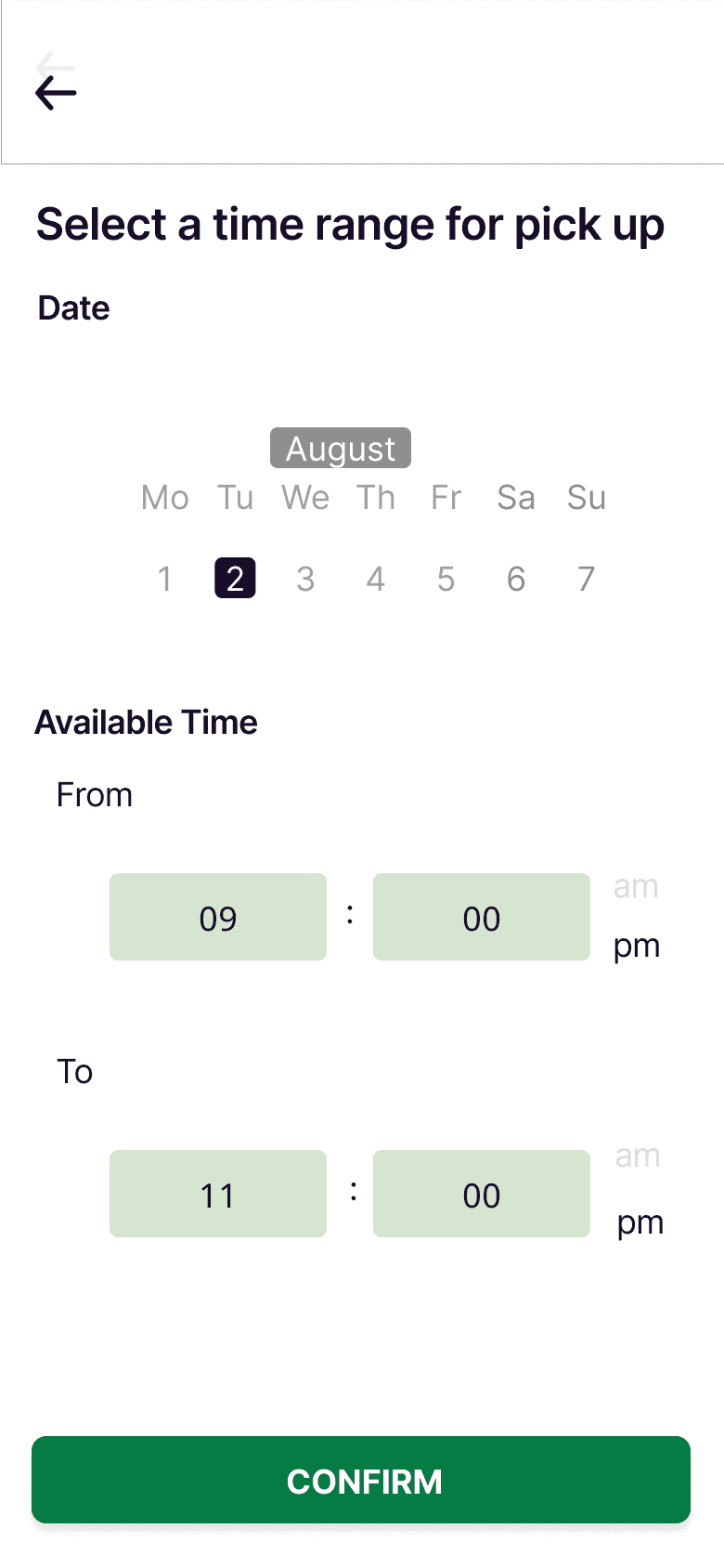
Select a range of available pick-up time
Design Details
Screens
Onboarding
Food Details
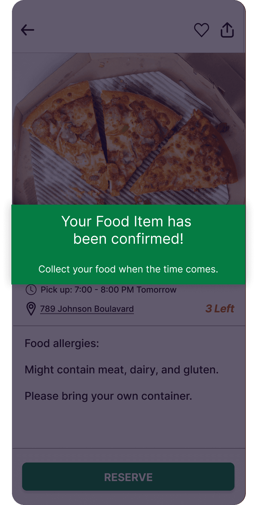
Confirm Oder
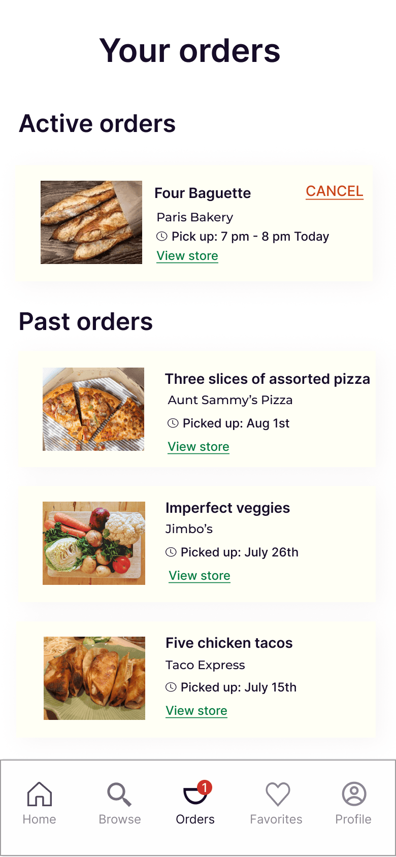
Orders Page
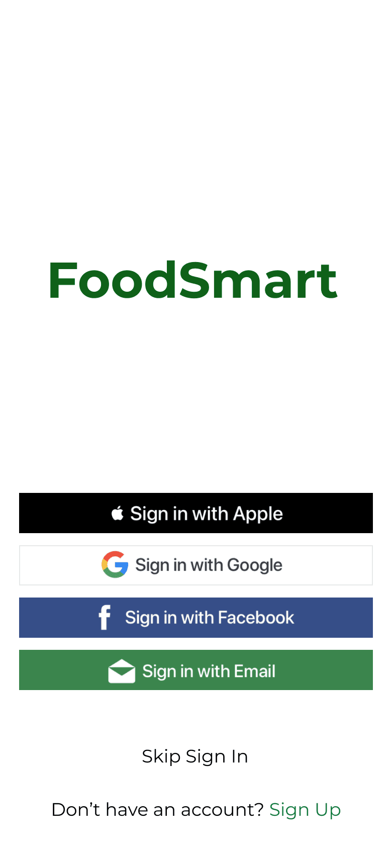
Login
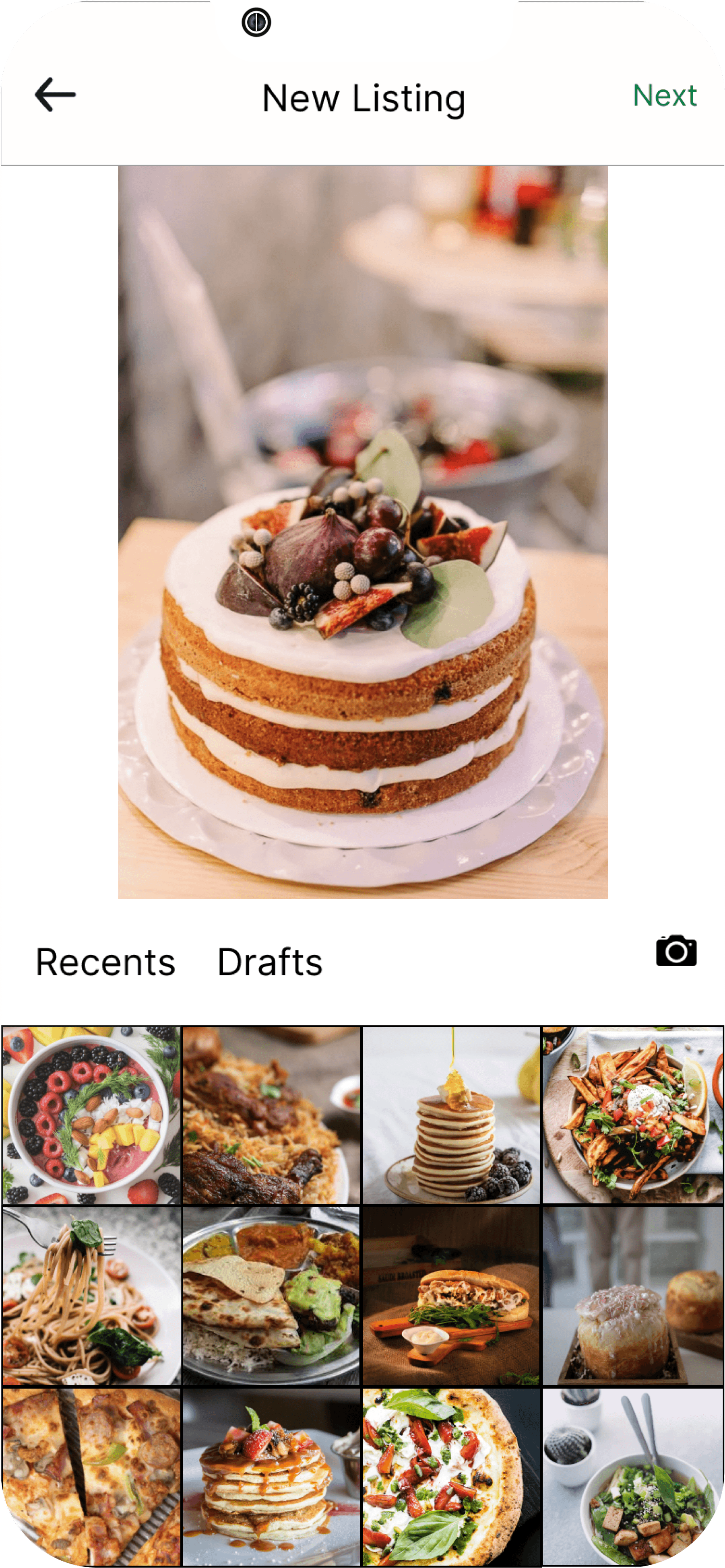
Upload Food
Select Pick Up time
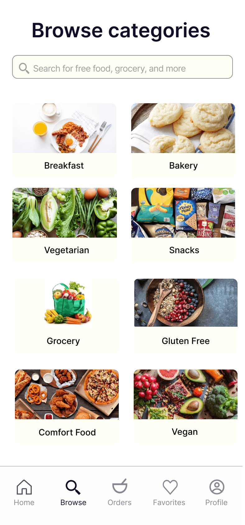
Food Category
Post Food
Explore Nearby
Map View
